
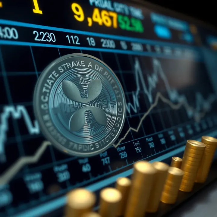
Ripple Coin Price Prediction and Market Insights
Get detailed Ripple (XRP) price prediction 📈 Explore historical trends, market sentiment, and expert views to understand XRP's future value clearly.
Edited By
Liam Foster
Advanced charts go beyond simple line or bar graphs to reveal intricate patterns and relationships within data. These visual tools are vital for traders, investors, and analysts who need to interpret complex financial and market data quickly and accurately.
Understanding the different types of advanced charts helps in choosing the right one for specific analysis. For example, candlestick charts are popular among stock traders in India for highlighting price movements within a day or over several days. On the other hand, heatmaps can quickly display sector performance during volatile market phases, making them highly useful for portfolio managers.
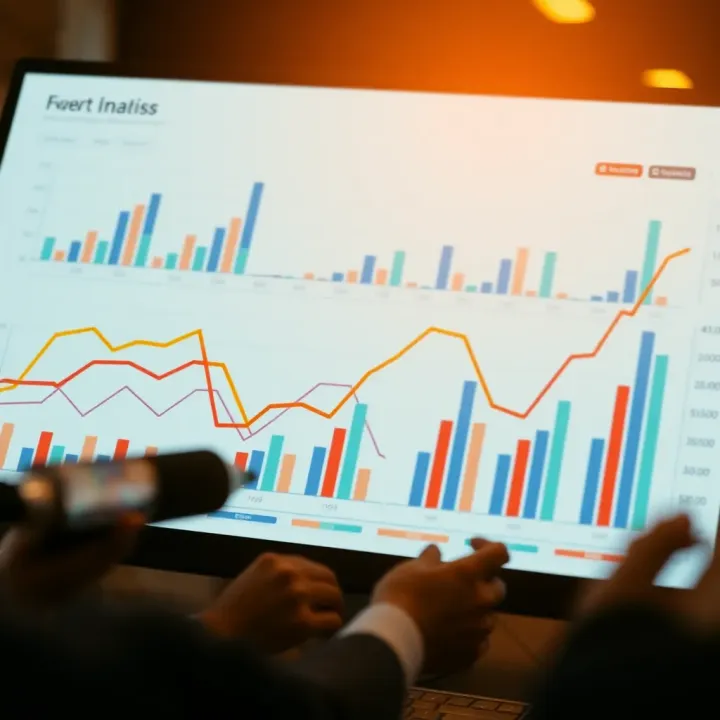
Advanced charts enable clearer decision-making by visualising trends and anomalies easily missed in raw data tables.
Besides types, knowing the ideal tools is essential. Platforms like Moneycontrol, Zerodha Varsity, and TradingView India offer built-in advanced chart options customised for Indian markets, supporting indicators like RSI (Relative Strength Index) and MACD (Moving Average Convergence/Divergence).
Practically applying these charts involves:
Analysing historical price swings with Renko charts to reduce market noise.
Using point-and-figure charts to focus on price direction and ignore time, which is crucial during unpredictable periods.
Combining chart types with volume data to confirm trends.
Proper interpretation can reveal not just where the market has been, but potential entry and exit points, helping you safeguard investments or capitalise on short-term opportunities.
With data volumes rising rapidly, mastering advanced charts is no longer optional. In India’s dynamic economic environment, these charts support professionals in sectors beyond stock markets, such as commodities trading, risk management, and financial analysis.
In the next sections, we will explore various advanced chart types, how to use them effectively, and the best software tools tailored for Indian users.
Advanced charts represent data in ways that go beyond traditional bar charts, line graphs, or pie charts. They provide deeper insights by capturing complex relationships, trends, or patterns across multiple dimensions. For finance professionals and traders, using advanced charts means the difference between just seeing numbers and truly understanding what drives market movements or investment performance.
Distinguishing simple charts from advanced ones is mainly about complexity and the kind of data they handle. Simple charts like line or bar graphs show basic comparisons or trends. For example, a line chart might track Sensex closing prices over a month. In contrast, advanced charts handle multiple variables simultaneously, showing flows, distributions, or correlations that simple charts cannot express clearly. A Sankey diagram illustrating fund flows within various asset classes or a heat map displaying market volatility across sectors are good examples.
Since simple charts tend to focus on one or two variables, they work well for summarised data or smaller data sets. Advanced charts, however, excel when data is layered or interdependent and when the user needs detailed insights to make informed choices.
Advantages of more complex visualisations in data representation include greater clarity for complex scenarios and uncovering hidden patterns. For instance, a Radar (Spider) chart can compare multiple mutual funds across performance indicators like risk, return, and expense ratio — all in one glance. This helps analysts quickly grasp where a fund stands compared to its peers.
Moreover, advanced visuals can reduce information overload by organising vast data into intuitive formats. This can help investors avoid costly misinterpretations and spot opportunities or risks earlier. The practical benefit is better decision-making based on deeper understanding, not just surface-level numbers.
Types of data that benefit from advanced charts usually involve high-dimensional or hierarchical information. Time-series data with multiple metrics, supply chain flow data, or customer segmentation data lends itself well to advanced charting. For example, traders analysing price fluctuations along with volume, volatility, and moving averages across sectors find advanced visuals like bubble charts more insightful than basic line charts.
Data that captures processes or flows, such as money movement in banking or product routes in logistics, also demands more sophisticated charts like Sankey or Waterfall diagrams.
Industry examples where they offer clearer insights include:
Banking and Finance: Visualising cash flow, risk exposures, and portfolio diversification benefits greatly from waterfall and heat maps.
Manufacturing: Process efficiency and defect tracking can be understood better with control charts and spider charts.
E-commerce: Customer behaviour analysis, such as browsing patterns and purchase funnels, benefit from flow charts and density plots.
Using advanced charts in these areas not only saves time but also enhances clarity, helping professionals to grasp complex dynamics quickly and act accordingly.
Advanced charts are not just a fancy addition but practical tools that uncover hidden insights and support smarter choices in sectors handling vast and layered data.
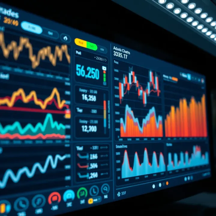
Advanced charts serve as essential tools for traders, investors, and analysts who want to move beyond basic graphs and extract deeper insights from complex data. Each type of chart brings its own strength, making it easier to spot patterns, track changes, or compare multiple factors at once. Understanding these common charts and their practical uses helps professionals select the right method to present data clearly and effectively.
Heat maps display data using colours to represent varying concentrations, which makes it simpler to spot clusters or gaps in large datasets. For instance, in stock market analysis, a heat map can show which sectors are performing well or lagging based on colour intensity. Density plots go a step further by highlighting data distribution over a continuous range, useful to visualise peaks in trading volumes or price changes.
In finance, heat maps help identify risky areas in portfolios by highlighting volatility levels or credit exposures in different asset classes. Hospitals and healthcare providers use density plots to track disease outbreaks or resource utilisation efficiently, drawing attention to hotspots needing attention.
Radar charts allow you to compare multiple variables side by side, plotting them on axes arranged radially. This format is effective to assess several performance metrics simultaneously. For example, an investment portfolio’s risk, return, liquidity, and diversification can be visualised together to quickly gauge balance.
Marketing teams frequently use radar charts to benchmark product features, brand appeal, or customer satisfaction against competitors. In performance analysis, these charts help HR professionals review employee skills across various dimensions, facilitating focussed training plans.
Waterfall charts break down cumulative effects over time or categories, clarifying how initial values change through positive or negative impacts. A trader tracking profit sources and deductions within a quarter benefits from this visual as it dissects profit contributions clearly. Sankey diagrams track flows and their relative sizes, often depicting energy transfer, cash movement, or data processes where volume and direction matter.
Financial analysts use waterfall charts to explain profit and loss statements, showing exactly where profits are gained or lost. Supply chain managers rely on Sankey diagrams to monitor product flows from raw materials to delivery, helping identify bottlenecks or losses.
Choosing the right advanced chart depends on the data’s nature and the story you want to tell. Tools like heat maps excel in density visualisation, while waterfall charts clarify step-by-step changes.
Understanding these charts equips finance professionals with sharper analytical perspectives, ultimately leading to better-informed decisions and strategies.
Choosing the right software is a key step when working with advanced charts. The tool you pick influences how easily you can create, customise, and interpret complex visualisations. For traders, investors, and analysts, efficient tools can save hours and reduce errors, especially when handling large datasets common in finance.
Both open source and commercial tools offer valuable features for advanced charting, but the choice depends on your budget, expertise, and specific needs. Open source options like Python's Matplotlib and Seaborn libraries, or R’s ggplot2, provide great flexibility and are widely adopted in Indian analytics circles. They support extensive customisation and integrate well with data from local Indian markets. However, they require some programming knowledge.
On the other hand, commercial tools such as Tableau, Microsoft Power BI, and Zoho Analytics provide more user-friendly interfaces with drag-and-drop options. These software packages also offer Indian market-specific data connectors, enabling you to pull data smoothly from sources like the National Stock Exchange (NSE) or Bombay Stock Exchange (BSE). For finance professionals juggling multiple data streams, these integrations simplify the process immensely.
One crucial factor is how a tool handles Indian data formats and sources. Many Indian spreadsheets contain dates in DD/MM/YYYY format and numbers using lakh and crore units. Advanced charting tools must interpret these correctly without forcing manual conversions. Additionally, integration with APIs from Indian financial platforms or regulatory bodies like SEBI can streamline real-time data fetch for up-to-date analysis.
For instance, Power BI offers connectors for Indian financial databases, allowing seamless work with data in familiar formats. Customised solutions can also connect to UPI transaction datasets or GST returns, which analysts might find useful for specific market studies. Choosing a tool that understands local formats and data can reduce errors and speed up reporting.
Tailoring charts to meet specific needs can make a big difference in how insights are communicated. Advanced charting tools often allow adjustments to colour schemes, axis labelling in Indian units, and adding interactive elements like filters or tooltips. For example, a broker preparing reports for clients across different states might customise charts to highlight regional variations in sales or investments.
At the same time, automation saves time, particularly when dealing with repetitive reports. Many tools support templates where you can set the chart style once and update the data automatically each time a new report is generated. Macros or scripts, especially in tools like Excel and Python, help automate tasks such as fetching data, running analyses, and refreshing charts quickly.
Efficient customisation and automation not only improve accuracy but also let analysts focus more on interpreting data rather than preparing visualisations.
Using templates and macros helps professionals meet tight deadlines, such as during quarterly financial reviews or pre-festival sales forecasting, without sacrificing quality. It’s worth investing time upfront to develop these reusable resources.
Selecting the right charting tool considering Indian-specific requirements ensures that data visualisation is both precise and practical, helping professionals make informed decisions faster and with greater confidence.
Advanced charts pack a lot of information, but their strength can also be their weakness. The key lies in how you present and structure the data to ensure users extract meaningful insights without feeling overwhelmed. This section highlights best practices that maintain clarity while delivering depth, especially for traders, investors, and analysts working with complex data.
Balancing detail with readability means offering enough information for analysis without cluttering the visual. For instance, a waterfall chart tracking quarterly revenue changes should focus on major components rather than listing every minor expense. Too many data points or colours make charts confusing and harder to interpret quickly.
Avoiding overcrowding is practical when presenting data trends or comparisons. Use selective labelling—highlight critical values or outliers—and keep other labels minimal. Interactive dashboards can also help by letting users zoom into specifics only when needed, reducing instant visual noise.
Common pitfalls include overusing colours or 3D effects, which often distract rather than aid comprehension. For example, a 3D pie chart might look fancy but can distort perception of slice sizes. Another mistake is cluttered axes or inconsistent scales, which mislead decision-making. Stick to simple, clean designs emphasising the story behind the data.
Choosing colour schemes matters beyond aesthetics. In India, certain colours carry cultural associations—red often signals alert or losses in finance, while green indicates gains or growth. Accessibility is also important; colours should be distinguishable for those with colour blindness. Tools like colour-blind friendly palettes ensure your charts remain inclusive.
Presenting data relevant to regional and sectoral interests makes charts meaningful for Indian professionals. For example, an investor looking at agriculture commodity trends needs visuals tuned to monsoon cycles and regional yield variations. Similarly, fintech analysts might focus on digital payment uptakes in tier-2 and tier-3 cities. Localised data points connect directly with the audience’s needs and drive better decisions.
Effective advanced charts strike a balance: enough detail to inform without overwhelming, colours that resonate culturally and aid accessibility, and data centred on the audience’s context. This approach ensures complex data becomes a useful tool, not a source of confusion.
By following these guidelines, Indian finance professionals can leverage advanced charts that communicate clearly, reflect local nuances, and foster smarter analysis and trading decisions.
Advanced charts offer more than just visual appeal; they are powerful tools that unveil deeper insights, guiding better decision making. For traders, analysts, and finance professionals, correctly reading these visualisations can mean the difference between spotting a lucrative opportunity and missing key market shifts.
Identifying trends and outliers is a fundamental step. Trends reveal the general direction of data points, such as rising stock prices or sales growth, while outliers indicate unusual behaviour that could be risk factors or hidden potentials. For example, in a heat map showing trading volumes across sectors, a sudden spike in a particular segment might signal an emerging market trend or a speculative bubble that demands closer scrutiny.
Recognising outliers helps avoid blind spots. Suppose a radar chart comparing performance metrics across multiple companies shows one firm outshining peers in revenue growth but lagging in debt management; that outlier flag could steer investment decisions one way or another.
Cross-referencing with other data sources strengthens the validity of interpretations. An advanced chart may display quarterly profit trends, but without consulting macroeconomic data—such as RBI’s policy rate changes or GST collections—the picture remains incomplete. Lending institutions, for instance, often combine loan performance visuals with credit bureau reports to assess repayment risks more accurately.
In e-commerce, sales heat maps are cross-checked with customer feedback and inventory levels, ensuring that spikes in demand translate to real opportunities rather than temporary anomalies. This layering of data prevents hasty conclusions based on visual clues alone.
In Indian manufacturing, companies track supply chain flows using Sankey diagrams to pinpoint bottlenecks. One major textile mill reduced production delays by interpreting these charts alongside raw material delivery reports. Similarly, Indian banks employ waterfall charts to monitor loan disbursal and repayment patterns, helping them tighten credit controls effectively.
E-commerce platforms like Flipkart and Amazon India use advanced visualisations to map customer purchasing behaviour during festive sales. Analysts spot regional trends that allow better stock allocation and targeted marketing, thus boosting conversion rates.
Visual tools uncover relationships hidden in raw numbers. For instance, combining density plots with transactional data reveals clusters of high-risk credit card users in specific areas. This insight drives better fraud prevention strategies.
Moreover, by layering time series data with geographical visualisations, analysts can flag seasonal fluctuations affecting demand or supply, which helps fine-tune inventory and pricing policies accordingly.
Effectively interpreting advanced charts enables finance professionals to pivot strategies quickly, cut losses, and seize emerging opportunities backed by clear data evidence.
In summary, reading advanced charts with attention to trends, anomalies, and complementary data sources provides a sharper, more reliable basis for decisions. Real-world applications in Indian sectors prove that beyond the colourful graphics lies actionable intelligence essential for staying competitive.
Get detailed Ripple (XRP) price prediction 📈 Explore historical trends, market sentiment, and expert views to understand XRP's future value clearly.
📈 Discover what drives Reliance Industries' share price! Analyze recent trends, market shifts, and key growth factors to make smarter investment choices.
🔍 Explore how RBI approved forex brokers in India ensure safe trading. Learn about regulations, benefits, risks & smart broker choices for your investments.
📈 Explore Reliance Industries' 2030 share price forecast based on market trends, financials, and India's economic outlook. Insights for long-term investors.
Based on 8 reviews